Zelle @ Huntington Bank
C2B and C2C In-app money movement made easy
Role: UX Design Lead
Year: 2021
Product Type: Native mobile application
SUMMARY
Huntington × Zelle — Business Account Integration
Huntington needed to bring Zelle to business account holders — enabling peer-to-peer, business-to-business, and peer-to-business transactions in a single, seamless experience. The catch: no one had done this before. We were Zelle's first client to attempt a unified personal and business integration.
The Challenge
About 30% of Huntington's business customers also held a personal account, but couldn't use Zelle across both. The goal was to bridge that gap without fragmenting the experience — one entry point, two account types, zero confusion.
Designing without established patterns was both the constraint and the opportunity.
Business Goals:
• Increase the adoption rate for business accounts
• Drive transaction volume through Zelle
DISCOVERY
Primary and Secondary Research
With no precedent to reference, I initiated a rapid research sprint — competitive analysis, an app audit of Huntington's existing Zelle experience, and stakeholder interviews to fill the gap left by limited user research funding.
The competitive analysis confirmed what we suspected: no competitor treated personal and business transactions as a unified experience. The app audit gave me a clear picture of existing architecture before considering how new functionality might integrate. Stakeholder interviews — some of whom were small business owners with hybrid accounts — provided grounded insight into real transaction behavior.
ASSUMPTIONS I HOPED TO DISPROVE OR VALIDATE:
1) The funding source matters more to users than whether they're sending or requesting
2) Users would think of this as two separate products — "personal Zelle" and "business Zelle"
Both turned out to be wrong.
Defining the Model
Teams couldn't align on whether to present this as one Zelle experience or two. Rather than let the conversation continue in circles, I put low-fidelity concepts on paper and brought visuals into the room. That shift unstuck the team.
We took two models back to Zelle for feedback. Their response reframed the entire problem:
There is no "Business Zelle" and "Personal Zelle." To the user, there is one Zelle — and they can draw from either account type.
That clarity narrowed scope immediately and pointed us toward the right solution.
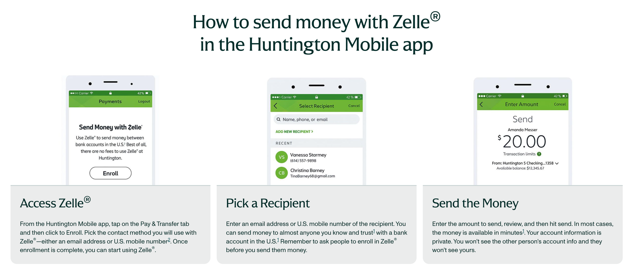
Interaction Design
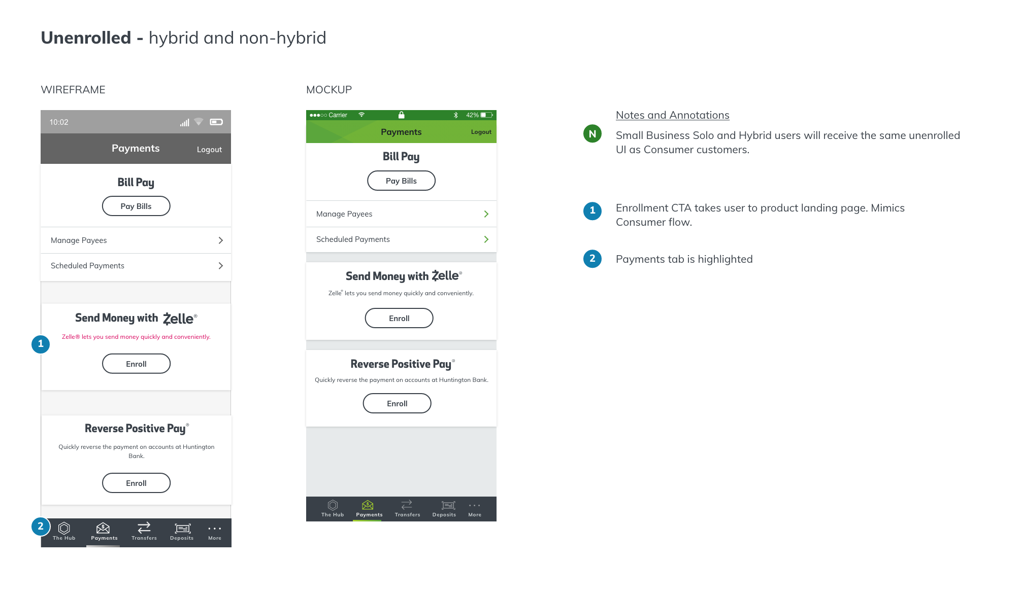
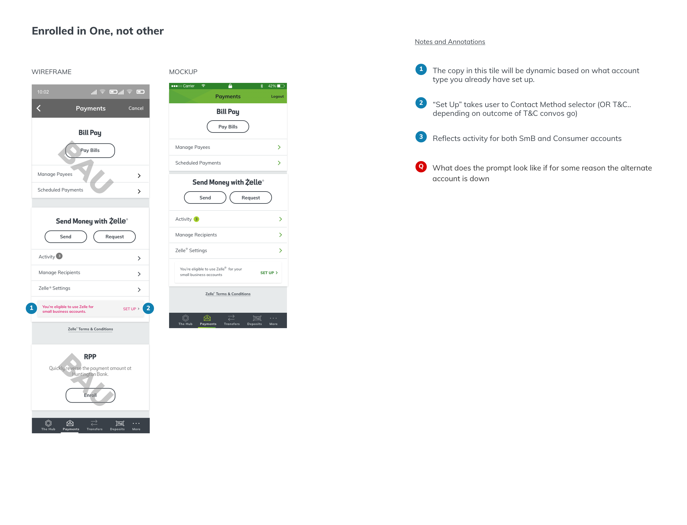
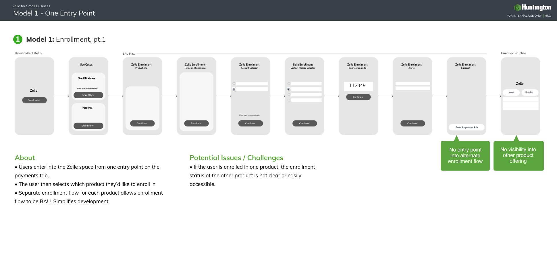
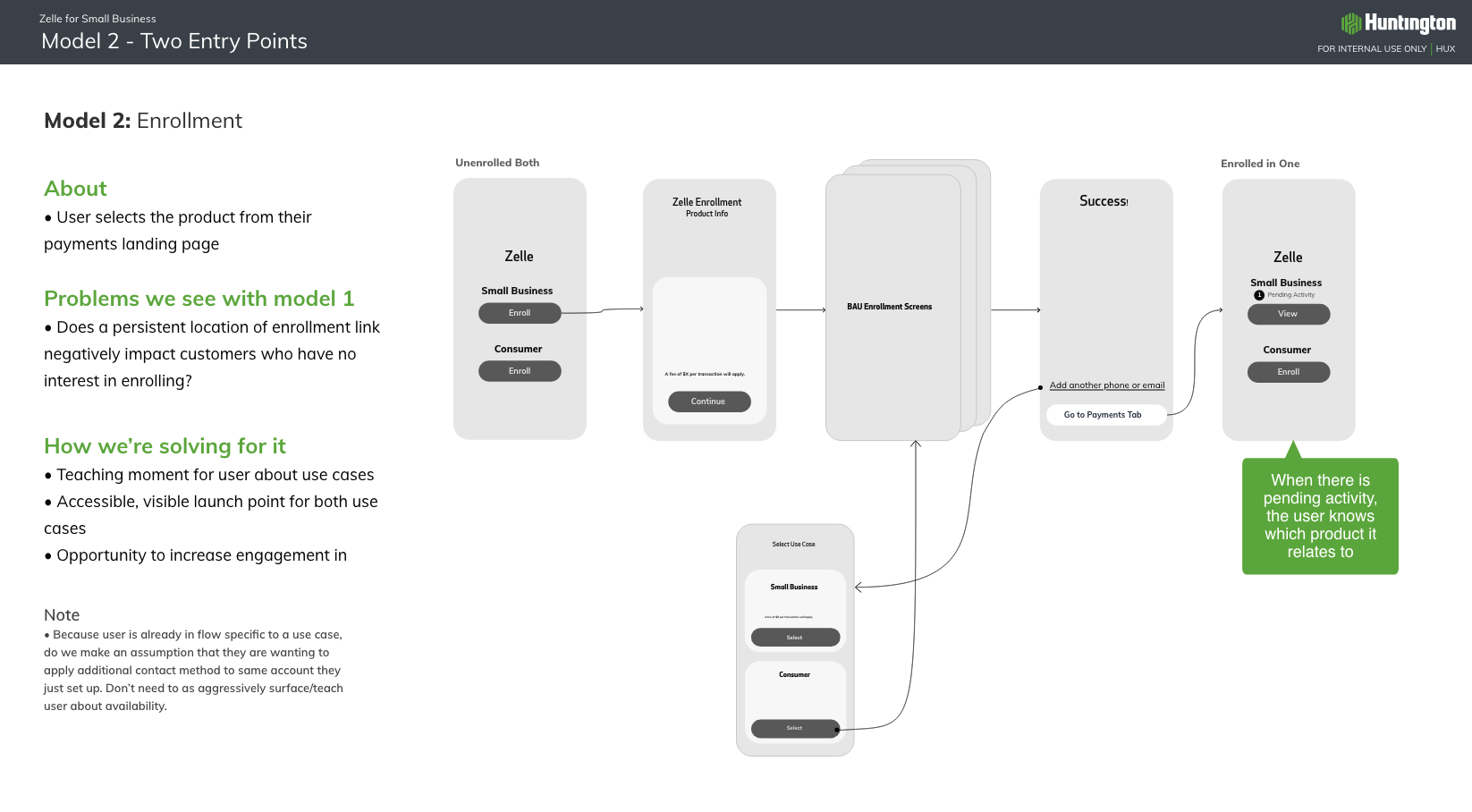
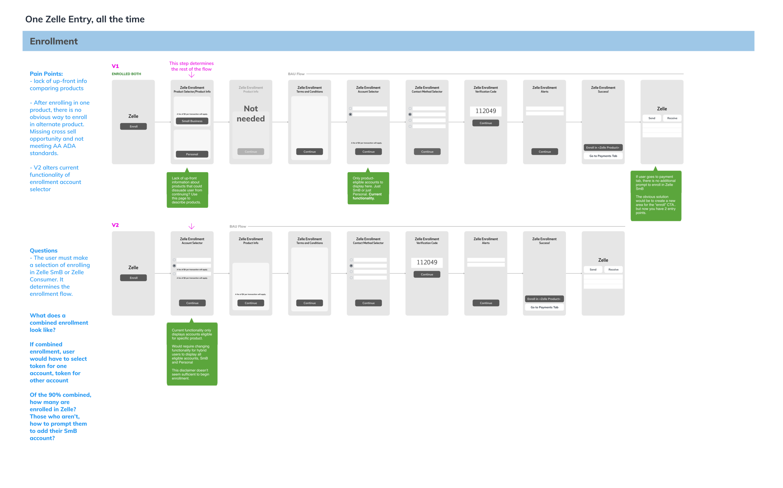
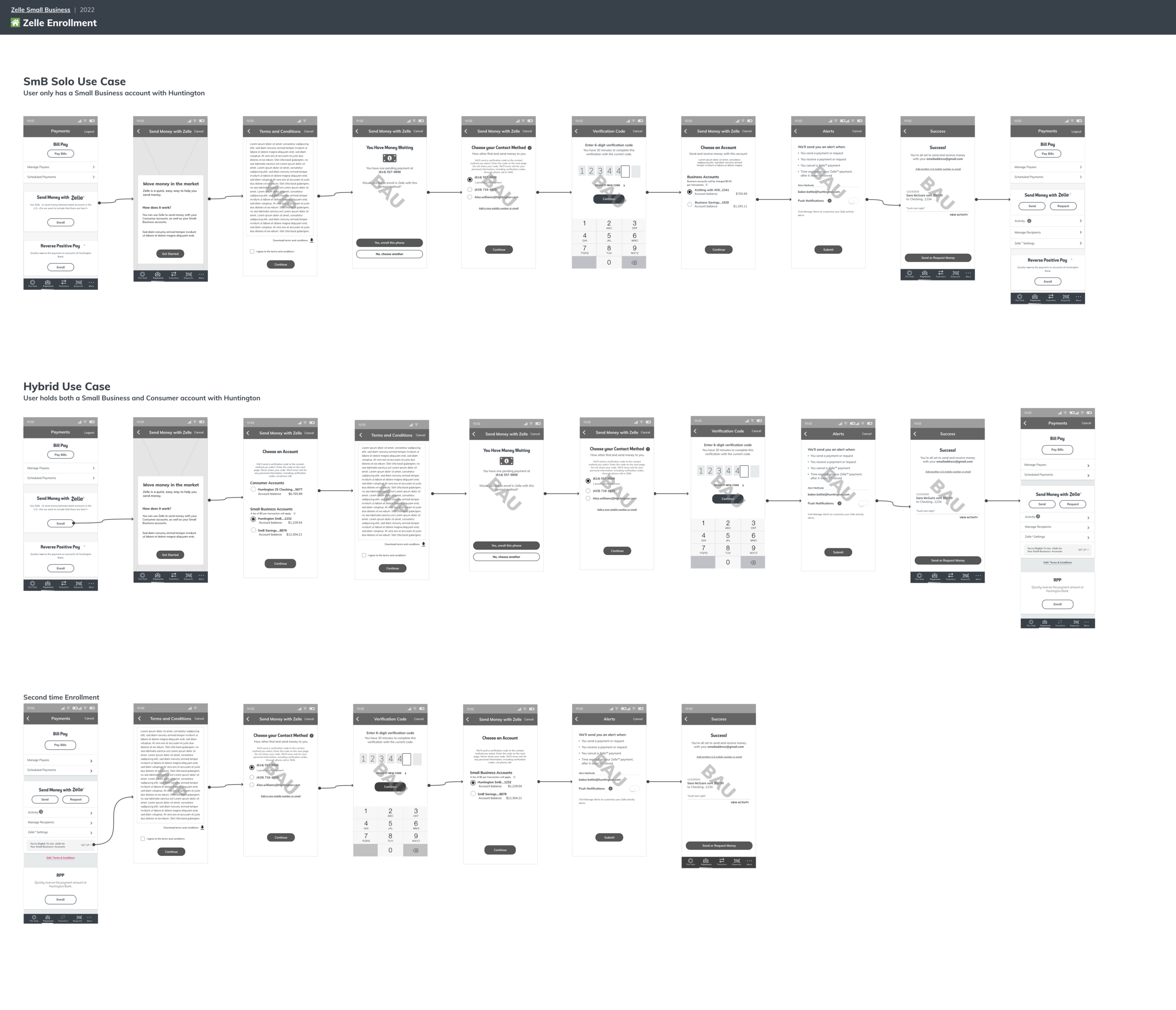
With architecture understood and a model confirmed, I mapped user flows across the core use cases — first-time enrollment, enrolling the second account, sending, and requesting. Task flows surfaced every decision point a hybrid user might encounter.
Two iterations emerged around the entry point: one where users select account type, one where they select the specific account. The second was the obvious choice — it matched the existing mental model and required less deviation from current-state behavior.
The final outstanding question was how to surface the alternate account to existing users. The solution informed users about the other available Zelle feature and launched them directly into enrollment — simple, functional, and on-brand.
Outcome
The solution met Zelle's guidelines, integrated seamlessly with the existing consumer experience, and required minimal dev lift. A genuine lean UX win — maximum impact, minimal complexity.
Scheduled for release Q3 2022.