

MIRROR
Background: Mirror has been a successful international clothing retailer for over 20 years. They specialize in having something for everyone, but without an online store, they are missing out on growth.
Role: UX Designer
Goal: To reach more customers, strengthen standing against direct and indirect competition, and increase sales
Solution: Update brand logo and create a responsive online store that reflects Mirror's fresh, stylish, and relatable brand.
Process: Research --> Define --> Design --> Test
Timeline: 4 weeks
RESEARCH + DIscovery
TOOLS USED: MARKET TREND ANALYSIS, COMPETITIVE ANALYSIS, INTERVIEWS
market & industry research
Being out of the e-commerce clothing retail industry for so long, Mirror was in a good position to observe and analyze the market and position themselves strongly against the competition. By starting off with conducting market research, I was able to identify how to set Mirror's website apart and where to invest our resources. I compared and contrasted players in the fashion retail industry to understand indicators of success, the audience, and user expectations. I did some primary research by analyzing competing brand's websites and identifying pain points and pleasure points. From here, I created provisional personas to begin thinking of who might make up Mirror's user base.

INSIGHTS:
Today’s shoppers want a curated customer experience that taps into their emotions, whether browsing through their phone or shopping in a store. They expect a high level of convenience with the ability to move between devices seamlessly.
Connecting with shoppers through social media is paramount.
People care about being conscious shoppers and want to know that their clothing is being sourced and manufactured in a sustainable, ecological, and ethical way.
interviews
To better understand the pain points and goals of those who shop for clothing online and to test a few of my assumptions, I developed an interview script and conducted user interviews with participants who fell within the provisional persona profiles I’d established. I asked each subject questions about their shopping habits, preferences, and annoyances. During the interviews, I took notes as I asked questions and observed.
"it’s just less stressful to shop online than in a store, but most stores besides Amazon are not as easy to order from. "
“The air smells better”, she says; “it’s clean, spacious, and the people that work there are really nice and helpful”.
"I like [shopping on Nordstrom's website] that it’s easy to add something to your cart without disrupting your search, there are excellent filters,
including neckline, style, etc., multiple angles to see the item, and customer reviews."
TAKEAWAYS:
Confidence in the size guide is key
Detailed reviews help turn over customers
People expect a special perk - free shipping over certain amount, guaranteed 5 day shipping, etc.
SYNTHESIS + DEFINING
TOOLS USED: INTERVIEW SYNTHESIS TABLE, PRIMARY PERSONA, EMPATHY MAP
Following the interviews, I set about gathering, organizing, and looking for relationships within the information I'd gathered. I first transcribed the interviews and formatted the responses in an interview synthesis table, which allowed me to more easily understanding the user's responses and see patterns. I grouped related feedback together, and drew insights from the groupings. Exploring the data in a visual way like this made it easier to spot behavioral relationships, which were then used for the foundation of my user persona.
Alec is the primary persona that emerged as a composite of my research findings. A young, single engineer living in Nashville, Alec spends his time busting his butt during the week so he can enjoy the weekends traveling. He's incredibly outdoorsy, but also very career driven, so his time and money are in short supply. He does most of his shopping online, as it saves him time and energy. He values a shopping experience that helps guide him through the process, has a quick and painless shipping and return policy, and that is clear and transparent about what he is buying. Since he goes on a lot of last minute adventures, he depends on online shopping website to give him strong details about the product, as well as explicit reviews from other users.

To further explore relationships and develop the persona that emerged from the data I’d gathered and mapped, I created an empathy map made up of observations and statements from my user interviews. Empathy maps are tools that and can be utilized at various points in the research and design process, that help the team keep the design user centered. Having Alec's feelings, personality, and needs available for reference helped drive the later phases of design, in which I could look back at specific quotes and details when thinking about priorities for the product I was designing.

KEY INSIGHTS
Clothes shopping can be highly emotional, and people shop for different reasons. Some avoid retail shops for the anxiety the crowds bring, or the bad lighting in the dressing rooms. Some cherish the experience of shopping in stores - the lovely smell, the helpful sales associates. All things considered, today's shoppers have one major goal thing in common: efficiency. People wish to minimize the time they spend shopping, while also expecting to easily find exactly what they want. Fundamentally, people's shopping goals are to feel confident about purchasing clothes online that will work for them.
PROJECT STRATEGY
TOOLS USED: PROJECT GOALS MAPPING, PRODUCT ROADMAP, SITE MAPPING
comparing business & user goals
Moving from research and synthesis into the next stage of defining the product, I created a map of the business goals, user goals, and technical considerations. Identifying the core goals for the user and the business, while considering the technical limitations, helps to define the highest priority needs for the business and user and viable solutions for achieving those needs.

DEFINING & PRIORITIZING FEATURES
With the project goals established, I generated a features matrix, with features presented in order of priority in terms of development, investment, and importance to business and user goals. Alec's needs and priorities were used to focus the exercise. This served as a very useful roadmap and overview checklist throughout the project.
Next, I conducted an open card sorting exercise to understand how user's may group information on Mirror's site. The online survey enabled me to survey 3 participants remotely and gain empathy for the way they may navigate through a retail website.
INSIGHTS:
The categories and patterns created in this card sorting study provided helpful insight into how people within Mirror's customer base think about clothing categories and navigation. Their feedback helped inform my decision about how to organize the categories on Mirror's site. If the goal is to help users (like Alec) find what they are looking for easily, and ultimately guide them to a purchase, this exercise was valuable in confirming user's expectations and preferences.
site map
Based on the results of the card sorts, I created a site map outlining the relationship of content on Mirror’s site, with the goal of creating the most simple and intuitive navigation possible.

INTERACTION DESIGN
TOOLS USED: USER FLOW MAP, SKETCHING, WIREFRAMING, PROTOTYPING
With an understanding of Mirror's content foundation, I moved into ideation. I created a user flow to think through paths a user might take and roadblocks they might encounter on Mirror's site in order to complete tasks related to completing purchases on the site. In this diagram, Alec moves through the process of entering Mirror's website and going through with a purchase. Mapping this user flow helped me to put myself in the position of the user and to prioritize as I began wireframing and prototyping.

sketching
Before digitally wireframe, I sketched out some ideas. This gave me the opportunity to get many different ideas onto paper quickly and be able to easily modify the design.

wireframing
After determining some key UI requirments, I began wireframing some fundational pages informed by my user flow. This set of wireframes shows the pages that a user would encounter as they progress from entering the site on the home page towards purchasing an item of clothing. These frames were developed with the goal of quickly translating them into a prototype, so that I could begin testing my design early in the process.
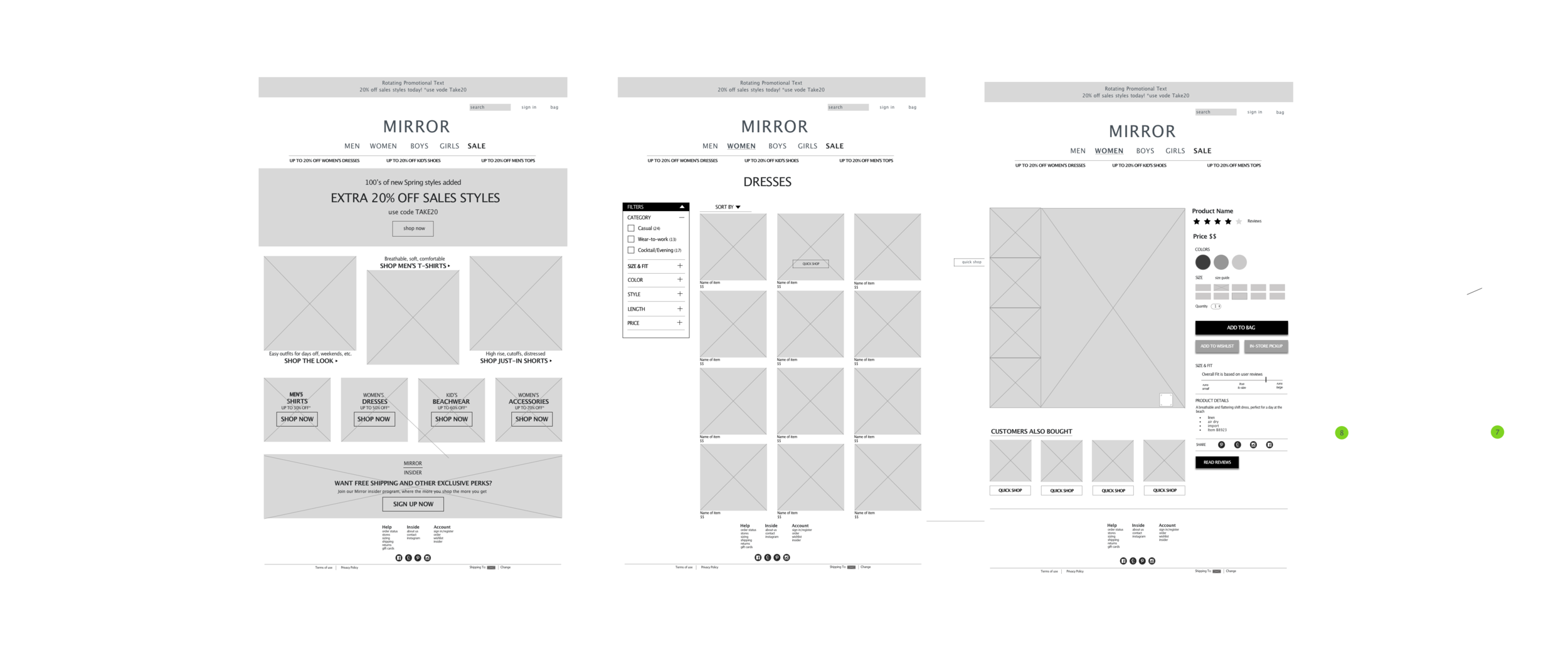
responsive design
To begin thinking about how Mirror's content and layout would adapt and adjust across different device sizes, I began working on responsive layouts for the home page.

low fidelity prototype
I employed prototyping multiple times in the course of designing the new site for Mirror. In this first lightweight, low-fidelity prototype, I quickly brought my wireframe screens (without UI elements) into InVision and built a lo-fi prototype to share with users. This allowed me to gather feedback early in the design process and test my design and assumptions before before progressing further.
high fidelity prototype
After creating the low fidelity wireframes and iterating based upon feedback, I created an updated, higher-fidelity prototype with more pages and tested again.

USABILITY TESTING
TOOLS USED: TESTING PLAN AND SCRIPT, PROTOTYPE, AFFINITY MAP
Four participants were asked to browse through the prototype. I asked each participant to complete two tasks based off the scenario in the User Flow. I observed each and took notes as they navigated the site.
Priority Task: Find a dress and determine what size is needed based on the size guide and reviews.
affinity map
After performing high fidelity user testing, i needed to synthesize the results and observations of testing. To do so, I created an affinity map as a way of interpreting and prioritizing my findings. The insights gathered from my observations inform the solutions and next steps in the far right column.

Takeaways:
Overall, users were able to navigate the site smoothly, find items efficiently, and navigate to checkout successfully. However there were some points in the flow that caused confusion or distraction, including how "favoriting" an item works, and clarity in the reviews. Some users liked that the reviews are an overlay, others preferred to just scroll down. Additionally, the prototype failed to meet some user expectations in terms of the reviews. While each shopper has individual and unique needs, meeting each participants needs was going to be a challenge, but it shed light on just how much users rely on reviews to follow through with a purchase. It's not enough for the reviews to be simply informative, they must also be compelling. The feedback from user testing helped greatly in determining what features need more attention and what features should be given higher priority moving forward.
UI DESIGN AND ITERATION
TOOLS USED: MOOD BOARD, STYLE TILE, UI KIT
Brand Identity
For Mirror's visual design, I began by defining the brand attributes, which were informed by the project brief and my user research. The attributes were anchored around 4 central characteristics of the brand:
MODERN / ACCESSIBLE / QUALITY / STYLISH
MINIMAL / FRESH / RELATABLE / TIMELESS / TRUSTED / HONEST /
MAINSTAY / DIVERSE / NEUTRAL / CLASSIC / SUSTAINABLE /
FUN / UNCOMPLICATED / DIVERSE / TRENDY / PLAYFUL
I then began collecting some brand style inspiration via Pinterest.

sketches
Before delving into digitally translating the mood board into a logo, I sketched out several pages of ideas before picking 3 to work on in Illustrator.

The initial, unrefined exploration shown above helped me hone in on a few different directions I might pursue. Reflecting once again upon Mirror's brand attributes, I determined that a simple logo would best convey the feeling of a brand that was clean, modern, simple, and appealing to many people. From here, I decided to get rid of fussiness and make the logo a simple wordmark. Further, I felt it would be a good match in terms of appealing to the aesthetics of my primary user audience (Jenna, my persona), as well as the broader customer base that Mirror aims to attract.
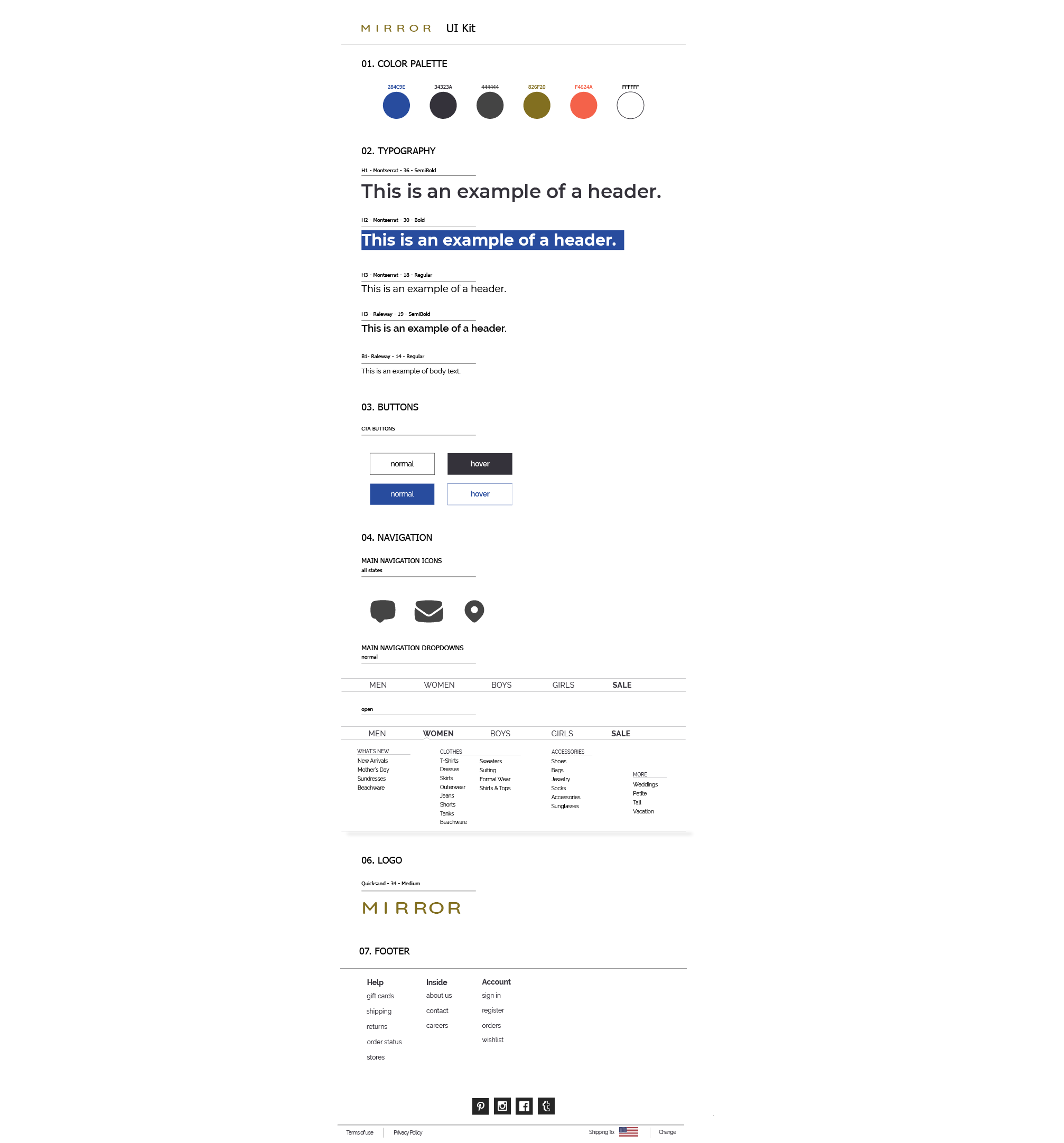
style guide & ui kit
With the design direction established, I created a Style Guide and UI Kit for Mirror. These are living documents which can be updated and added to as the site (and brand) develops and evolves. By documenting the UI patterns and components we use in the design, we can better ensure that they are repeated and, therefore, consistent across the product.

handoff & implementation
I then created a document to show the specs of the design for handoff. This offered an opportunity to review the design's cohesiveness once more and tighten up any discrepancies. The handoff below helped illustrate the excessive number of font styles and sizes I was using.

TAKEAWAYS + Next Steps
In the end, basing Mirror's design off of similar successful sites provided to be the best way to tackle this design task. Building Mirror's site in a familiar way enabled Alec (and other users) to quickly find and purchase the clothing they are looking for. Testing revealed that users expect certain conventions in terms of categorizing, filtering, and reviewing options, and deviating from the standard can confuse users and impeded their ability to successfully navigate, and impede the business's goal of increasing traction. Of course, if the user is unable to navigate and the business is not turning over customers, the basic functionality of the site is flawed.
By following a basic structure for designing Mirror's site based on research, grounding ideas in empathy, and testing often throughout the process, I had a map of how to move closer to my goal of creating a design that functions well and serves the needs of both the user and the business.
However, many questions remain. By building Mirror's site off retail website conventions, I was able to see where other websites fail and optimize Mirror's customer experience. But that doesn't translate to a necessarily delightful experience, and more work can be put into customizing and optimizing the user experience on an emotional level.
next steps
ITERATE & ADJUST
Make adjustments based on user’s feedback. This includes visual hierarchy elements, review options, filtering options, and general navigational issues.
HIGHER FIDELITY PROTOTYPE
Apply user feedback and then build a more detailed prototype. This includes showing hover effects and more pages.
TEST
After making adjustments to the interface, go back and test again for pain and pleasure points.